You can check the all the laws of UX here.
I’ve followed these practices for a while now.
Aesthetic-Usability Effect
Users often perceive aesthetically pleasing design as design that’s more usable.
It is for this reason that I tend to use Tailwind for all my projects.
The mobile first approach not only makes the apps responsive without much trouble (that’s the secondary benefit), it actually ensures that all the components are aesthetically pleasing to mobile users and not just a bunch of divs forced to fit into the mobile screen.
Doherty Threshold
Productivity soars when a computer and its users interact at a pace (<400ms) that ensures that neither has to wait on the other.
This is the most obvious one of them all. Your APIs should (and I make this my ground rule) not take more than 500ms to respond. Beyond that, if B2C product, you might have just lost a potential customer’s attention.
Even if you’re B2B product, sub-second APIs tend to give a better customer experience.
That being said, it isn’t always possible to improve API performance, maybe you’re stuck with an old framework or you have self hosted the backend.
In such a case, you can do these things:
- Add an animation while they wait for the API to resolve (not a plain progress bar or spinner).
- Turn the API into a stream or paginate the response
- Add a caching layer like redis.
Hick’s Law
The time it takes to make a decision increases with the number and complexity of choices.
This basically says don’t clutter your screen.
Examples
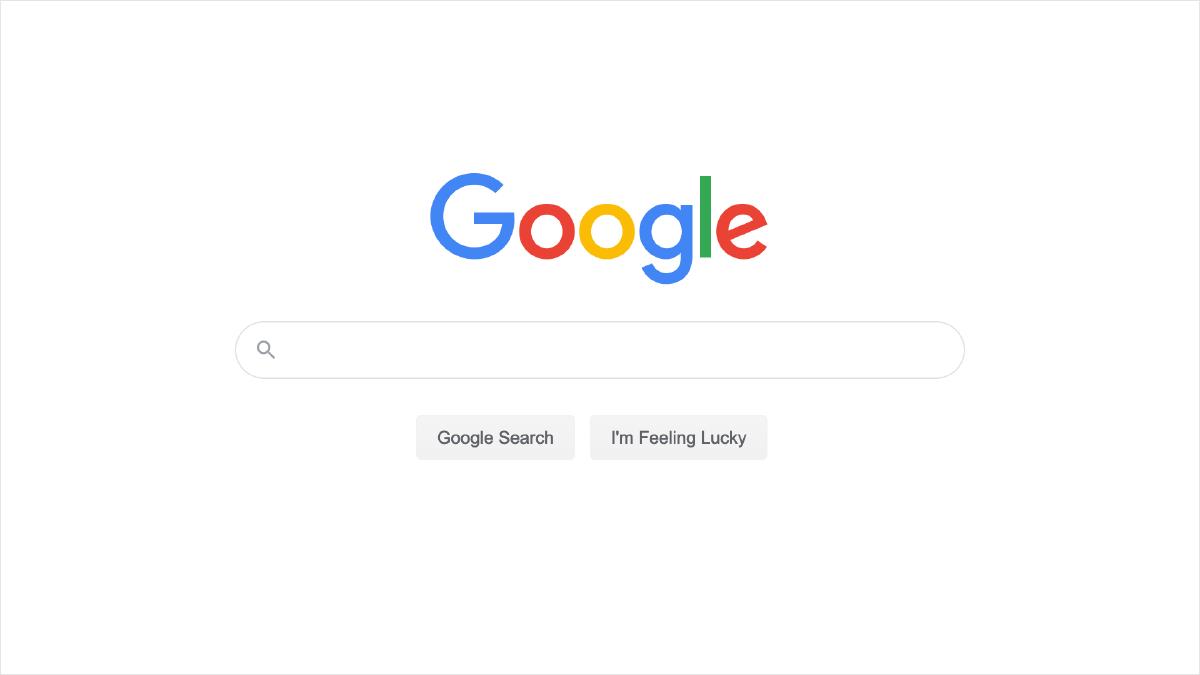
Here is an example of it:

Google Homepage
The Google Homepage could have a link to any one of the plethora of application or services they have but instead, they focus on one thing only… The search bar.
You might have seen those other search engines with news on the bottom or affiliate programs. Compared to them, Google Search just feels premium.
This law also somewhat ties in with Occam’s Razor
When building applications, I try to eliminate any unnecessary detail that I can, and if I have to show it there… maybe some use and some don’t, I usually provide a hide section button (also remembering their choices).
This enables them to focus only on the content that they actually need. All the action buttons are prominent but all the secondary actions can be hidden behind a dropdown menu of the page.
Peak-End Rule
People judge an experience largely based on how they felt at its peak and at its end, rather than the total sum or average of every moment of the experience.
All the D2C applications inherently do this where they focus a lot of effort on the first screen that the user interacts with, it is the point of initial perception.
However B2B application by and large ignore this part altogether where they would have some really old jQuery based login page or some bootstrap template based login screen.
